
Create a year-end Product progress report
In an attempt to summarize our collective accomplishments over the past 12 months, I decided to create a simple, 1-page chart that communicates the product advancements and highlights remaining product opportunities.
The Product Decision: Use the familiar customer process as a backdrop for reporting finer-grained enhancements across the entire product suite.

Flickr image source: http://tinyurl.com/gpea4r5
In an attempt to summarize our collective accomplishments over the past 12 months, I decided to create a simple, 1-page chart that communicates the product advancements and highlights remaining product opportunities.
Many people look to the end of the calendar year as a good opportunity for reflection and this is as true in the professional world as it is in the personal one. Twelve consecutive months would seem to provide a sufficient review period for attempting to understand the overall impact of the team's more significant product decisions.
I have previously written here about why I feel the Product Manager has a more pronounced need to establish credibility than most other roles in the organization. It is easy to make grand, sweeping promises but ultimately, a PM and his/her team will be measured (continuously!) by the results they achieve. And even those small victories can be short-lived as the team is pushed to address the next round of challenges.
So, it seems fitting that I take a little time during the last week of the year to revisit those promises I had made and to fairly tally up the "scores".
What drove this decision
In the spirit of transparency, I wanted to conduct an honest assessment of how we did or did not advance the product portfolio and then share that with the entire company. I had established clear objectives at the beginning of the year and now felt an obligation to compare our actual results with those original goals.
I was also hoping to create a new artifact that might even help motivate the teams. Something that said, "Look how far we've come!" If it turned out the way I thought it would, it could become a new collateral piece that gets the Sales all fired up, sending a clear message to them about how much easier it had become to tell and sell our story to customers.
Above all, I wanted to use this progress report as a reminder to the entire company that we have made great strides together along the very roadmap themes I laid out at the beginning of the year. It turned out that it was also useful for pointing out, even foreshadowing, where we'd likely be spending our time next year.
The decision: Use the familiar customer process as a backdrop for reporting finer-grained enhancements across the entire product suite.
Simplified customer business process
For the past few years, the Product team has been refining our understanding of our customers' core business process. We ultimately captured the process model in a single, clear diagram which we have been promoting and reinforcing with each major release so that, by now, everyone in the company was familiar with it.
This representation of the business process had been especially helpful in orienting the product team's efforts and now seemed to offer the ideal structure for lining up the various product initiatives from the past year. So I thought I would use it as the underlying structure for my progress report.
Plan of attack
Being a fan of 1-page artifacts, I set out to build a single chart that I could use to tell the story of the past year, one that would clearly illustrate our highs and our lows, our triumphs and defeats, our victories -- you get the picture.
Collapse the business process to create a familiar backdrop
Flatten the familiar process for context
I was confident that the process model we had been using for our own internal discussions - and which had been repeatedly validated by prospects and customers alike - would provide the right context for my new chart.
The original process diagram had filled the entire page. I tried to retain the familiar shape of the process but compressed it to fit in a much smaller vertical space. I removed the actor icons but kept the text labels for each step, moving them to the bottom of the new diagram to maintain the various transitions in the process.
Create a simple scale for relative comparisons
Horizontal lines set up a scale for comparisons
Next, I needed to create a way to compare the various product initiatives in a way that my audience could see the respective value of each project as it related to the customer's business process.
Ultimately I created a 3-point scale with the intentionally provocative labels "Poor", "Par", and "Premier." If I was going to use this chart to provide an honest report on how well we did over the past 12 months, I wanted to have a way to communicate where we had done well, where we had fallen flat, and where we were still struggling with mediocrity.
Plot trajectories for each product initiative
Plot each project as a trajectory
With these structural elements in place, I was now ready to add my data to the chart.
Instead of representing each initiative as single points on the graph, I chose to roll up the initiatives under more familiar customer-facing features and plot them as parallel vertical lines. Each feature had a bullet point to show where the feature would have been scored at the beginning of the year. I then extended an arrow from the bullet and the length of each line was meant to show how much we had improved the feature over the course of the past 12 months.
For some features, I stacked more than one arrow if we had taken several passes at it. Some features had no arrows which were meant to show a complete lack of improvement - even more meaningful when they appeared lower on the scale. It was absolutely my intention to highlight these features as ones that would require attention in the months ahead.
The impact
I had no prior experience creating a chart like this or even using a progress report to roll up the results of a year's worth of product roadmap initiatives. I will admit it that it was validating for me to see the results of our collective efforts captured in a single place though I recognize some obvious shortcomings with my approach:
- My chart only has upward pointing arrows - One might get the wrong impression that none of the work we did actually made things worse for our customers - ha!
- My chart ignores all the non-feature work - Anyone that did not work close with the Product or Tech teams might get the impression that this is all we accomplished when the truth is that so much more was done to support our growing customer base.
- My chart only exists because the story is mostly positive - I'm not sure I would have pursued this task if I thought it would have shown us in a bad light.
I'd like to think I'm not purposefully avoiding reporting on any negative outcomes but I knew that I would inevitably focus on those areas that made us look good. In the end, I think this is a fair report and have received similar confirmations from others in the company. I certainly achieved my goal of painting a clear picture for the company and my stakeholders around the improvements we've made from a year's worth of product investments.
Look for more reports from theProductPath around charts, evaluating product portfolios, and managing stakeholders here on PM Decisions.
More articles from our blog PM Decisions


Build a quick proof of concept
After realizing that I had failed in my previous attempts to head off a questionable new product idea being advocated by our head of Sales, I decided to fabricate a bare bones working example to advance the conversation.
The Product Decision: Outsource a simple prototype to an overseas development partner to avoid disrupting the in-house Engineering team.
Flickr image source: http://tinyurl.com/o8lbm83
After realizing that I had failed in my previous attempts to head off a questionable new product idea being advocated by our head of Sales, I decided to fabricate a bare bones working example to advance the conversation.
To be honest, I was more than a little intrigued by the new product being proposed, not because I thought it would prevent us from losing deals to our competitors - to my knowledge, we hadn't lost any yet, at least not for this supposed product gap. And it wasn't because the technology was particular fascinating or exclusive - in fact, many of our customers could likely build a lightweight version of this on their own without much trouble.
I'd have to say my curiosity was driven by the opportunity to create something new.
Our company has been building a large software platform for over a decade and it increasingly becomes harder and harder to innovate when you're towing along such a hefty code base.
One of the classic mistakes companies can make is to blindly pursue building a new product just because it is feasible for them to do so.
But I wasn't going to let my own fascinations cloud my judgment. One of the classic mistakes companies make is to blindly pursue building a new product just because it is feasible for them to do so. I know better than that and I didn't want to carelessly lead my team down the wrong product path.
The next step then, was to find a way to better validate the claims coming from our own Sales team but to do so with the minimum amount of effort and investment.
What drove this decision
This is a simple chart I created to help drive more meaningful conversations with our Sales team. I have yet to get them to pin down all of these numbers for a given "missing feature" but in their defense, we don't really collect and track sufficient/suitable data in our sales process to drill down this far. Still, this model does help to frame product investment decisions.
Our Head of Sales was steadfast, still convinced that our product had to have this missing functionality, mostly because our chief competitor was flaunting their own version in front of our prospects. I had tried - and failed - to squash the idea before it gathered any more steam. It was becoming clear to me that I would have to dedicate more cycles to this product proposal even if the end result (i.e. not moving forward) was the outcome.
My chief problem, however, was that our Engineering team was booked solid for the next few sprints and I didn't want to distract them with a side project that was still a long way off from being productized.
I needed a way to make some incremental progress with the new product idea without impacting the team's current development velocity.
The decision: Outsource a simple prototype to an overseas development partner to avoid disrupting the in-house Engineering team.
Giving a new project to an external team can be tricky. My goals were to properly scope the work up front, produce the desired results quickly, and have a clear path forward when the project was complete.
Plan of attack
I was focused on reducing the size of the project to the point where I had what I needed to start validating the product with our end users and prospects. That meant more than just providing good requirements however. I also needed to give the remote team the support it would need to complete the job and deliver the goods.
Define basic requirements and allowable shortcuts
One nice thing about sharing early prototypes such as wireframes or mockups is that your intended audience will often be very forgiving. I have found that when provided with sufficient clarification, users will focus on what's there and not obsess about what's not yet there.
I wanted to make sure that the proof of concept had enough relevant functionality in place to confirm our initial hypotheses. I also wanted to identify places where we could safely skip over steps that would have to be part of the final solution. These include the compulsory but more technically challenging operations like installation and authentication.
I wrote and delivered the requirements to the remote team being careful to emphasize the elements that would have to perform accurately for the end user. I then highlighted the remaining elements that didn't contribute directly to the end user experience where I felt we were safe in taking time-saving shortcuts (i.e.. "just hardcode it for now").
PROVIDE TECHNICAL SUPPORT TO TROUBLESHOOT the remote work
Our remote development team had been working with the company for several years but some new faces were joining this project. To make sure they could ramp up quickly and avoid any first-time stumbling blocks, I recruited a few key internal, technical resources to help launch and support the effort.
As it turns out, the remote team did hit some stumbling blocks in their attempts to use our new API and in resolving those issues, we actually uncovered - and fixed - some problems with our own API deployment process!
Secure the POC artifacts for the next round
When the proof of concept was finished, I had the remote team demo it to a few folks from our Engineering and Product teams. We were all pleased to see the results and I felt confident that we now had a suitable working model to go back with our Sales team and begin engaging customers.
The impact
I had already expressed my doubts to the Sales team about the actual effects of adding a component like this to our product mix - specifically, that it would not significantly advance competitive deals that are in jeopardy. With a working proof of concept in our hands now, it would be easier for us to determine exactly what (would-be) customers were looking for and whether this would affect their buying decision.
I would still have much more work to do in building a truly shippable product if I was wrong and customers latched onto this proof of concept. But I am convinced that I made a good tactical decision at this point and that we would realize a good return on this particular product investment decision.
Look for more reports from theProductPath around product validation, feature prioritization, and managing stakeholders here on PM Decisions.
More articles from our blog PM Decisions

Sit with customers for product training
In yet another attempt to get out of the building and sit face to face with my customers, I decided to grab a seat in the next customer training session.
The Product Decision: Spend most of the class in listen-only mode but also weave in more interactive, product-focused discussions.

Flickr image source: http://tinyurl.com/neccbh5
In yet another attempt to get out of the building and sit face to face with my customers, I decided to grab a seat in the next customer training session.
Product Managers, of any rank, need to get to know their end users. You don't get to hide behind a fancy senior-type title to avoid the difficult and often humbling experience of interacting with the people who buy and use your products.
But it can be more challenging for the Product Head Honcho to carve off blocks of time to sit with customers because the role has so many other responsibilities.
What drove this decision
In the back of my mind, I knew it had been too long since I had had any real interaction with our users. For months, I had been relying on solid, but second-hand input from my Product team to help drive roadmap decisions but I very much wanted to supplement that with my own data points.
Some weeks back I learned that the company had scheduled the next multi-day training class for customers and partners. I knew that would be a decent opportunity to step away from the office and spend some quality time with my target audience.
The decision: Spend most of the class in listen-only mode while also weaving in some interactive, product-focused discussions.
Our customer training course is a week long affair and operates on a fairly tight schedule because of the range of functionality we cover to address a rather broad set of use cases. As such, I would not be able to carve off big blocks of time to do proper customer interviews. So rather than hijack the agenda, I looked for other windows of time for both formal and informal interactions with the attendees.
I made it my goal to bring back new product insights to my team and to learn as much as I could about both our existing and future product direction.
Plan of attack
You don't get to hide behind a fancy senior-type title to avoid the difficult and often humbling experience of interacting with the people who buy and use your products.
As I mentioned, the training agenda is tight so I would be squeezing in opportunities here and there to cover my own topics. To kick things off, I gave the standard welcome speech on the morning of the first day and wove in my parallel agenda as we covered the week's schedule.
I teased the audience by inviting them to attend a "working lunch" where I would deliver a live overview of new enhancements that were part of the major release that had just been pushed the week before.
I also proposed that we gather before class on one of the days to preview some of the exciting ideas we were brewing up in our Research Lab. This would be a unique opportunity for me to pick their collective brain and for them to help steer the products themselves.
And finally, I encouraged anyone looking for 1 on 1 time to track me down during the regular breaks to talk about any specific topics.
Emphasize the value of feedback from customers
Product roadmaps must balance inputs from many sources. (Click to enlarge)
In every interaction, I tried to stress how important it was for me and my team to hear from our users. I talked about the different options they could utilize for passing back their concerns, suggestions, and praise (ha!).
I was careful, however, not to set the expectation that we would act on every input. I showed a product-centric chart that I use to educate/remind both external and internal audiences of the complications of owning a product - specifically that the inputs are many and the available resources are finite.
Spotlight product updates based on voice of the customer
To reinforce those messages, I queued up some of the new product features and enhancements we had delivered over the past few releases that were largely driven by customer feedback. I talked about how early interviews had revealed common pain points across customer implementations. And I showed how, through constant validation with end users, we had been able to advance the product to address their requirements.
Recruit end users and administrators for future R&D
Always be recruiting. That could be the slogan for our research team - and they never let me forget it. So I also put in a few plugs for our ongoing R&D initiatives. Passing out business cards is easy but somewhat impersonal so I also followed up with an email to all the participants.
The impact
I did gather some good product feedback from the group, some of it unsolicited and some of it through more formal discussions. I would recommend opportunities like this to other Product Managers looking to spend quality time with a captive audience.
The class participants seemed appreciative as well. They had positive reactions to the connections I made between customer feedback and product innovation. There also seemed to value having a direct line to the company's Head of Products, if only for a short period of time.
Look for more reports from theProductPath around customer research, customer development, and voice of the customer here on PM Decisions.
More articles from our blog PM Decisions


Assess the Product Portfolio
After recognizing that our development team would remain inundated with far too many product requests, I decided to examine our entire collection of products with an eye toward slowing or reversing ongoing product investments.
The Product Decision: Create a model for evaluating current and future product portfolio decisions.

Flickr image source: http://tinyurl.com/nl2c4vh
After recognizing that our development team would remain inundated with far too many product requests, I decided to examine our entire collection of products with an eye toward slowing or reversing ongoing product investments.
Like any Product team, we are never in short supply of feature requests, product suggestions, looming technical debt, must-have components, urgent customer pain points, etc. And we do our best to stay on top of the things, trying to keep all parties happy-ish. But over the past few months, I had started to see important product enhancements slipping from each release and was able to attribute those slips to other competing product priorities.
Because there are quite a few moving parts in a typical software development shop, there are any number of places you could start the analysis. Our problems could be related to bad grooming practices, poor scoping efforts, or even an understaffed engineering team. But I know the problems we were having were not limited to a single product or any one PM. It was simply proving too difficult to keep all our balls in the air.
We had launched a generous number of products over the past decade but poking around at the ground level was likely to be an unproductive exercise. I needed a model to help me and our team evaluate decisions across our entire portfolio.
What drove this decision
I was getting anxious about the number of product-related discussions the Management team was having and becoming convinced that they had lost some perspective on what we had already committed to. In fact, there were signs that the company's entire product strategy might be in need of a refresh so I scheduled a mid-year strategy meeting with the management team to do just that. But I felt there was a need to connect the day-to-day challenges we were having with each product release to the product discussions that were happening (at an increasing rate) at the executive level.
I needed to create a backdrop for our high-level product investment decisions that would also drive real benefits at the troop level.
The decision: Create a model for evaluating current and future product portfolio decisions
Over the past decade or so, we had made decisions to create new products and not all of them turned out to be winners - no real surprise I guess. The bigger problem was that we had managed to sell each product to some subset of our customer base so we had an obligation to support it through troubleshooting, bug fixing and occasionally, even enhancement-ing. This obligation grew non-linearly with each new product.
I knew the customer usage patterns were irregular and more importantly, the revenue we derived per product was inconsistent and unpredictable. Despite this, we had no plans to sunset any of the products thus perpetuating our dilemma indefinitely.
I needed to spark some productive conversation. I needed to shed some light on the impact of our past decisions and try to head off some questionable proposals that were brewing in the company.
Plan of attack
The diagram that I built only needed to be as complex as the audience I was targeting. I felt I could communicate a great deal with coarse-grained data elements, where conclusions could be drawn (no pun intended) by counting boxes or showing the relative size or positioning of boxes. I ended up with something along these lines (pun fully intended):
Simplified Product Portfolio Model
1 - Plot the products on a simple graph based on revenue vs. customer use
I strongly recommend that you organize your graphs so that the most desirable position is in the top right corner. Both X and Y axes should go from low to high, least to most, etc.
I started by placing each product on the chart based on how much customers were using it and how much revenue it generated. In using these axes, I was hoping my products would be stacked up and to the right. If plotted accurately, it should be easy to defend ongoing and future product investment decisions with this simple graph.
In an attempt to communicate more information with fewer charts, I decided to use the relative size of the product "boxes" as an indicator of our current investments. Without aiming for exactness, I was able to quickly explain where our resources are being deployed. A slightly more complex approach would have been to use other graphical elements to break down the current investment by Product, Engineering, Operations and Support.
2 - Clarify the ratio of Products to Product Resources
Our company currently has more than 15 products in our portfolio and I'm sad to report, not nearly enough Engineers and PMs to manage a portfolio of that size. We have found ourselves in this situation after years of adding new products because at the time, we believed they were crucial to our company's success.
But like many eager, young software companies, we never seem to plan well for the long-term maintenance and support of each new product. I can't help but make the comparison to the decision of adding a new baby to your family. Everyone thinks it a wonderful idea at first but after spending a number of grueling months bringing it into the world, you find yourself responsible for taking care of another living thing for the rest of your life (or your life at the company at least).
With a few, carefully placed text overlays, I listed on the diagram, the relative sizes of our current teams which revealed the stark truth about our current staffing situation. This helped set the stage for a productive conversation about acquiring more Product/Engineering resources or reducing the size of the product portfolio or both.
3 - Future investment and product goals
I used the same model to spell out some of our short and long term product strategy. With the boxes already arranged on the chart, I added arrows to indicate where we would expect to see movement in the months ahead. Specifically, I predicted the movement of various products over the next 6-12 months in terms of increased/decreased usage and increased/decreased revenue.
By adding a few crude marks over some of the product boxes, I was able to show which products in which I intended to reduce our investment and even more, which I thought we should retire in the months ahead.
The impact
There are more messages that can be highlighted and communicated in a chart like this. Seeing all the products intelligently placed next to each other on a single page inevitably invites more strategic conversations like:
- Why are we still supporting this product if the usage rate is that low? It's time to retire it.
- When is the last time we updated the technology behind those products? They're due for a refresh.
- How long has it been since we last sold this product? Let's try lowering the price.
Armed with this new model, I was able to drive a strong Product-focused agenda at the Strategy Summit and was even able to successfully head off some premature ideas that could have led us further down the wrong path.
Look for more reports from theProductPath around charts, product portfolios, and managing stakeholders here on PM Decisions.
More articles from our blog PM Decisions


Evaluate a product integration with a potential partner
After some considerable prodding from the Sales team to help advance the largest deal in the pipeline, I decided to formally assess the key vendor integration options that could help us win the business.
The Product Decision: Create a graphical model highlighting the integration points for the customer's use cases to help validate a new partnership.

Image source: https://www.flickr.com/photos/emanuelec/5869072769
After some considerable prodding from the Sales team to help advance the largest deal in the pipeline, I decided to formally assess the key vendor integration options that could help us win the business.
It is rare that any single product can wholly satisfy a customer's needs and quite common that multiple products will be used in concert to get the job done. Cloud-based products for example, like the one my company offers, are often combined to accomplish set of use cases. Think of opening your Dropbox files in Microsoft Office 365 to make changes. Or pulling Flickr photos into a Slack channel to help the team troubleshoot a problem.
Through an investment in both SOAP and REST APIs, we have made our cloud product open to integration as well. We often point partners (and customers!) to these full-featured web services when we encounter requests for functionality that hasn’t been productized. But since it may be necessary to initiate the integration from our end, we also provide hooks in the platform for outbound calls.
I’ve always been intrigued with software integrations. Part of that interest is derived from exploring the forethought that goes into making any software product extensible and the rest is observing how the combination of two or more products results in a new creation that may never have been seen before.
What drove this decision
Sales was getting anxious - more anxious than usual
We had been salivating over a large opportunity in the sales funnel, a big deal in the hopper - a hit-your-quota kind of transaction. For weeks, the Sales team had been working hard to address the prospect’s long list of requirements and to zero in on the areas where there was lingering concern.
This particular prospect was asking for more functionality than we could - or would ever likely provide. The Sales team was eager to determine whether another vendor could be introduced into the deal (always a risky proposition) to fill the functional gaps.
It was now my job to confirm whether or not this was technically feasible and if so, how it would be done. But in order to have all the parties understand the proposed solution which would likely be unfamiliar and quite technical, I was going to need to explain it with some pretty pictures.
The decision: Create a graphical model highlighting the integration points for the customer's use cases to help validate a new partnership
Diagrams help to communicate with a broader audience
Joining the conversation late, I needed to orient myself to better understand the other vendor's product. I set up a few phone calls with both the vendor and the prospect, had some internal discussions with the Sales team, and scribbled a lot of notes. When I thought I had a good, initial model, something worth sharing, I polled each of the groups again, passing around a 1-page diagram where I had squeezed some boxes and lines together to create a crude chart.
These early rounds of validation prompted some tweaks to the diagram and I was able to tighten down the overall integration story. What also became clear was that, to make this happen, some non-trivial product investment would be involved on both sides. I knew we would soon be having a number of internal and external “business case” or ROI-type discussions and that the crude chart would not suffice. I decided to step it up and invest in a more robust model.
Plan of attack
My goal with this improved model was to capture and communicate the concepts that would best help with the downstream decision making. This meant not just determining the number of integration points to fulfill the customer's use cases but the relative complexity and level of effort of each, as well. Clarifying to all parties which use cases required which integration scenarios meant that we could better prioritize the relative work involved.
HIGHLIGHT the origin of each integration point
As I reviewed the use cases, I looked for places where the functionality of one of the products ended and where it needed to be picked up in the other product. This made it easy to determine which of the products would initiate a new integration scenario. On the diagram then, I drew uni-directional arrows between systems that are themselves, usually represented as fancy boxes.
I usually label the arrows with numbers or text to help direct the reader to the start of the flow. I also find it valuable to identify the “trigger” itself. For example, “a user clicks the upload button to start the process” or “the process is initiated when a user is added to the address book” or “each new PDF document added to the folder will initiate a call to the other system."
When more than one back and forth call is required to accomplish a particular scenario, the diagram get more interesting. Does the calling application wait for an immediate response (synchronously) or will the reply come back some time later (asynchronously)? What happens when the response never comes back - which party is responsible for resolving the loose ends?
Identify dependencies
In identifying the origins of each integration point, I’ve invariably highlighted new dependencies between the products. Dependencies must be evaluated carefully because changes to the callee’s interface will affect all callers. It is common for Product Teams to update their interfaces (we do it with our own web service interfaces) and must consider backward compatibility to minimize the impact on existing integrations.
For the sake of simplicity and because these would start to clutter up the sample diagram, I’ll skip over the security considerations, the deployment models (e.g. desktop, on premise, private/public cloud, etc.) and any differences in how each company licenses their products.
Identify alternatives for each Integration point
As the saying goes, there is more than one way to skin a cat. This can apply to product integrations as well. I always look to indicate any possible alternatives that I discover so that the decision makers can better evaluate the full range of possibilities - even if the alternatives seem less practical at first.
For each alternative, I try to include the relative levels of effort, costs, etc. I usually have a good reason for choosing the primary option so I spell out that rationale for my first choice. Included in the rationale could be viability concerns about the integration technology choices, the types of connection(s) required, overall speed/performance, error handling, etc.
Distinguish between what's available now and in the future
In this particular effort, I learned that some of the integrations would be dependent on features that the other vendor had yet to release. To highlight that important variable, I made special, prominent notes about what would be feasible today vs what was yet to be built to support the integration.
The impact
I delivered the updated, more formal integration model to the teams and continued to participate in the partner discussion for a few more weeks. After both vendors had settled on a viable approach, we jointly presented to the prospect. The additional work to provide an integrated solution was spelled out along with the additional cost, some of which would be subsidized by the vendors. The final proposal, that included a modified version of my diagram, was well-received.
I often create and share models like this to weigh important decisions. I find it easier to grasp the complexity of a proposed solution when you are able to visualize the number of boxes and lines. Unfortunately, a diagram can't always communicate the longer term return on investment of a product integration. It doesn't tell you how many customers will use it or when you can expect sufficient revenue to cover the implementation costs. But that's another article....
Look for more reports from theProductPath around product validation, charts, and product strategy here on PM Decisions.
More articles from our blog PM Decisions


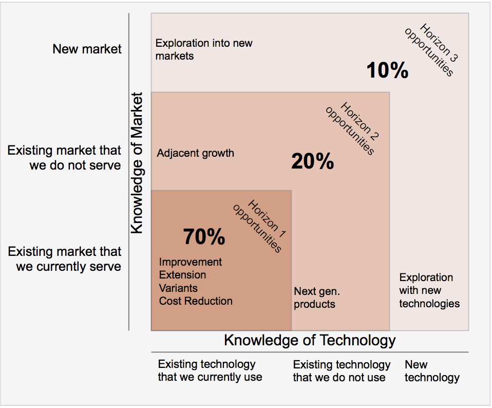
Present a Product Roadmap to the Board using the 3 Horizons Model
In preparing to present the new Product Roadmap to the Board of Directors, I decided to employ a popular investment framework to organize our product decisions.
The Product Decision: Use the 3 Horizons Model to present the Product Roadmap to the Board.

Image source: https://www.flickr.com/photos/donkeyhotey/6143615821
In preparing to present the new Product Roadmap to the Board of Directors, I decided to employ a popular investment framework to organize our product decisions.
If your company has a Board of Directors or similar advisory group that helps guide the organization, chances are they will be curious about where the product is headed; however, more than the other stakeholders, this group is likely to view your ongoing product decisions as a series of investments. And, like any investment, yours are expected to deliver positive returns down the road.
As the head honcho for the Product team, you are responsible for crafting a rendering of the product roadmap that gives them the appropriate level of detail. There a number of ways you can organize your product investments to maximize both short term and long term opportunities but communicating that plan to “The Board” can be a challenge.
What drove this decision
In refreshing our roadmap, the Product team had established high-level themes to guide decision making but these tend to be more appropriate for filtering and prioritizing work and less useful for calling out specific product initiatives.
The 3 Horizons model was first published in The Alchemy of Growth by Merhdad Baghai, Stephen Coley, and David White in 1999 and made popular by the likes of McKinsey, Geoffrey Moore, and others.
I knew our Board members would not have the patience or the necessary product-level knowledge to absorb a thorough presentation of our detailed product roadmap, filled with epics and stories. Plus it can be difficult to get a good sense of the overall product direction when sitting that close.
For this particular audience, I needed to use broad strokes. Specifically, I wanted to explain exactly where the investments were being made and how we expect them to pay off in the next 6, 12, and 24 months.
I first ran into the 3 Horizons model in a wonderful presentation entitled 10 Roadmap Tools created by Radiant Minds (now part of Atlassian, makers of Jira). They recommended using this tool to communicate a high-level product roadmap as a set of investments that extended the current business but that also created viable options for the future.
The decision: Use the 3 Horizons Model to present the Product Roadmap to the Board of Directors and show how we would balance short and long term investment opportunities.
I recommend exploring the Radiant Minds presentation and perhaps even reviewing the original source material for additional insights. I found this model to be convenient for speaking to our Board members - so that rather than try to impress them with impressive-sounding technical jargon, we were able to spend time talking through how we would leverage the technology to drive real, positive outcomes for the business.
The 3 Horizons model can help you organize your thoughts so that you continue to capitalize on the current customer opportunities while carving out appropriate cycles for favorable market conditions in the future.
Plan of attack
It would be impossible and also inappropriate to provide the full details of my company’s product roadmap here so I have obfuscated much of what follows. I have included a few examples that should help to illustrate the thought process I used in adopting the 3 Horizons model for our Roadmap presentation.
Horizon 1
The first horizon in the model shows how 70% of your investment should go into existing technology that you currently use and in an existing market that you currently serve. This best positions you to defend your current business and capitalize on your company's existing resources.
For our company, we used Horizon 1 to outline the scheduled work in the roadmap that would build on the technology components already present in our core platform. For example, we planned to develop a new mobile application for our customers based on feedback we had been gathering for the past few months. I explained to the Board that, because we had built front-end and back-end software like this several times before (and were quite good at it), the business risk for this new application was fairly low.
Horizon 2
In the second horizon, you describe how 20% of your product investment will utilize existing technology currently not in use in your company to address an existing market that you do not currently serve. Adopting proven technology lowers the risk for your company as you look to serve customers in the new market.
Internally, our teams had been researching an alternative to our outdated reporting infrastructure and, in the months ahead, we were planning on dedicating resources to the effort of overhauling our reporting engine. The new technology would allow us to better aggregate the information our platform collects and build helpful data-driven dashboards. As I explained to the Board, the Horizon 2 product investments would allow us to deliver an analytics offering to new and existing customers, opening up additional revenue opportunities outside of the markets we serve today.
Horizon 3
The final horizon in the model is used to highlight the remaining 10% of your investment, which is where you target new technology with the intention of entering a new market. It is admittedly harder to aim for that third Horizon - which explains the proportional size of this set of investments.
Our team has set its sights on eventually moving away from relational databases entirely and the decisions we made in this iteration of the roadmap reflect that. We are looking to the next generation of database technologies to help our software platform scale that in turn could open up much larger customer opportunities. Over the next 12-24 months, we intend to incorporate new technology into the platform to better position the company to go up market and pursue larger customer opportunities.
The impact
You will find that there are different audiences for your Product Roadmap and each audience may have different expectations - and different level of interest. Our Board responded positively to the overall roadmap presentation and was especially engaged in the investment-oriented nature of the product decisions based on the 3 Horizons model.
Look for more reports from theProductPath around product roadmaps, PM tools, and managing stakeholders here on PM Decisions.
More articles from our blog PM Decisions


Reset expectations around Engineering capacity
In recognizing that many of our company's developers had been committed to important engineering tasks unrelated to advancing product features, I decided to clearly illustrate our true capacity for product innovation.
The Product Decision: Clarify to stakeholders our true capacity for product innovation.
In recognizing that many of our company's developers had been committed to important engineering tasks unrelated to advancing product features, I decided to clearly illustrate our true capacity for product innovation.
The pressure on a Product Manager can be intense at times. On the one hand, you are responsible for answering the deceptively simple question, "what are we planning to do next?" All eyes are turned to you for long term product strategy and the product roadmap. And as the owner of the product roadmap, you will have no shortage of helpful suggestions streaming in, from many strong voices, constantly weighing in on what they think should be done.
Perhaps just as stressful though, is having to address the related but more nagging question, "why can't we get more done?" This was a recurring question in my company as many stakeholders were eager to see us move faster.
“Why can’t we move faster?”
”Why can’t we get more done?”
These are fair questions from well-meaning people but it didn't take long for me to realize that there was a fundamental misunderstanding at the senior leadership level about our true capacity for product development.
What drove this decision
If you are not directly attached in some way to the software development machinery in your company, then chances are you don't have a good appreciation for all that goes into building solid product features. The decisions that are made by Designers, Engineers, QA, and Operations are just as foreign to other groups as the inner workings of Sales, Marketing, and Finance are to us software types. In our company, though, there was growing frustration with the lack of progress being made on the product side.
The software team I joined had indeed struggled, missing targets, dropping features right before a big release, and generally falling victim to interruptions and emergencies. We have a strong Engineering team but a good number of them were being assigned to tasks that, while important to the company, were not contributing to product innovation.
In my new role as PM, I had a plan to begin a new chapter for product development at our company. Success would depend on building credibility early with stakeholders and a big part of that meant resetting some expectations. Specifically, I would need to explain why I would not be able to achieve as much as they had been expecting. I would have to justify why we weren’t able to accomplish more.

Image source: https://www.flickr.com/photos/jurvetson/2292656889
The decision: Publish a straightforward model that would clarify our actual capacity.
Through a number of internal meetings, I learned that members of our talented engineering team had been assigned to work on internal projects such as scaling our core software platform and optimizing our development process. Other team members were allocated to team management or committed to rotating assignments with Customer Support.
The net impact was that the size of our Engineering team had been reduced. The remaining developers were available to work with my Product team on new features but would also have to address bugs that cropped up. Then there were research tasks that did not directly yield new software but would certainly benefit future development. And finally, we had to plan around holidays, vacation days, sick days, and any scheduled technical training.
All in all, there are far fewer available cycles in a Release than one might think.
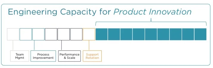
To clarify our true output capacity to our senior management team, I built a simple scoreboard of sorts for each release that showed how many FTEs were available for product development.
Plan of attack
Normally, I'd relish an opportunity to build some elaborate model but in this case there was no need for fancy diagrams. Instead, I created a simple picture using PowerPoint, similar to the image at the top of this post.
I started by using squares to represent each engineering resource making it easy to visually determine the total number of Engineers on staff. Then, using different colors for each bucket, I identified how many engineers were being assigned to non-product initiatives and labeled each initiative appropriately. I chose to omit specific names in the diagram, even when it was obvious (e.g. team leads).
The result? A clear model that illustrated our company's actual product development capacity.
The impact
You could disparage this approach and claim that I had prematurely adopted a defensive posture or taken a pre-emptive CYA step. But our senior leadership team was overdue for a reset. In the weeks that followed, in conversation after conversation I used the diagram to remind everyone exactly why we could NOT move faster.
This led to more productive discussions about resource allocation, hiring decisions, and generally rearranging priorities. And to me, those are the right kind of questions to debate.
Look for more reports from theProductPath around capacity planning, communicating with charts, and working with stakeholders here on PM Decisions.
More articles from our blog PM Decisions
In a week that seemed to bring every form of product choice a PM can encounter, I decided to exhibit strong product leadership on every front.
The Product Decision: Use each and every opportunity to demonstrate solid product governance.